Putting Narrative Art Into Context

There are many sub-classifications of narrative art. The significance of them is often tied to a specific time period or culture.

Historically, art that tells a story was praised for its quality and ability to convey its message through semiotics, placement, and format. It lost favour and made way for Modern Art in the early 20th century but I’m interested in working with the narrative styles. Not only because I enjoy solving the problem of composition in these images,  but also the idea that I’ve presented an open problem for others to solve and decode. Their solution then feeds back into the main story, and that could eventually lead to a metanarrative, with each instance of the main character in the whole having a backstory that isn’t yet written and, more significantly, is not written by me.

There are many ways to create a visual narrative, the most recognised (Artsome.co, 2017) are:

Simultaneous: uses patterns and symbols that are significant to particular cultures to convey a message or story that is meaningful to those that understand it. This type often requires intervention from the creator to be fully understood.

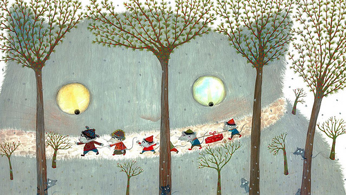
Continuous: where repeated images present a system of repeating characters to recreate an event within a frame. A repeat of the main character is used to signify the next part of the story.

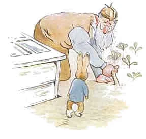
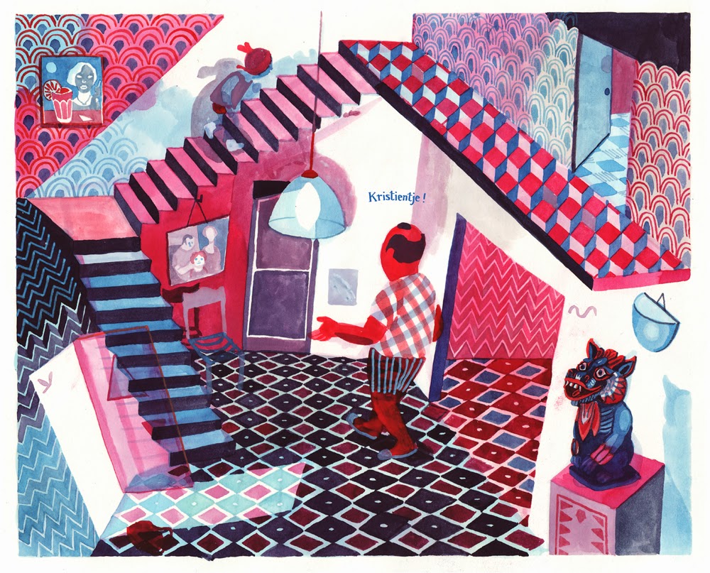
Monoscenic: everything is presented within one scene with no repeated elements. There are no character repeats.

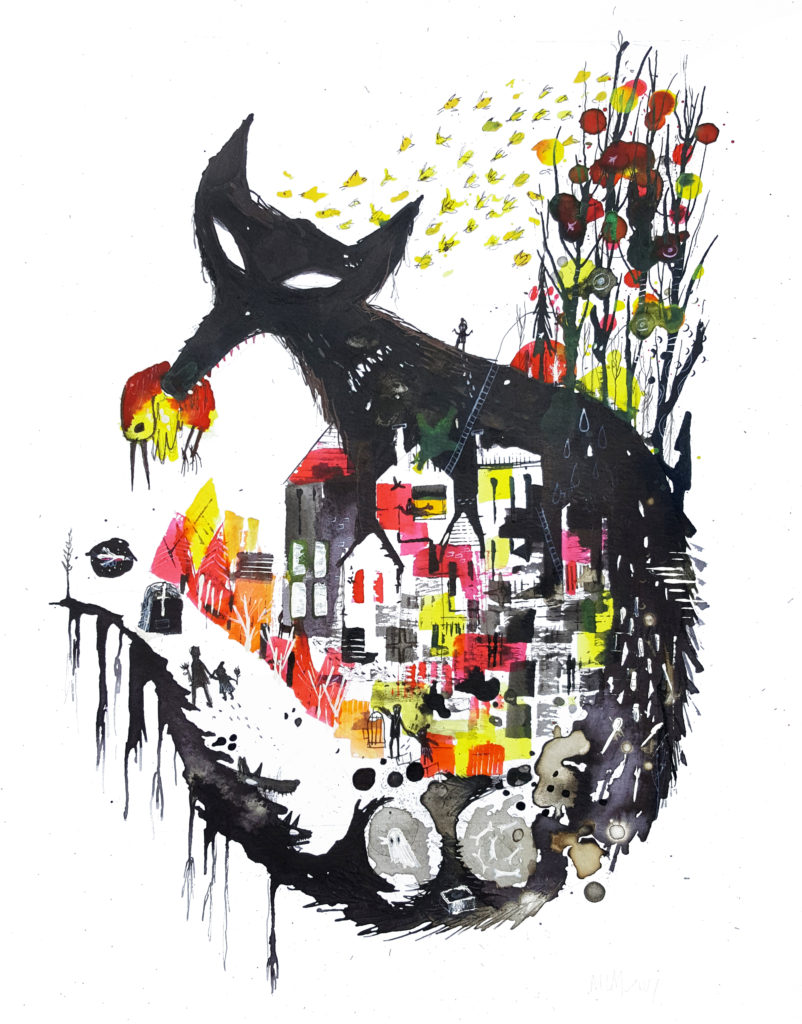
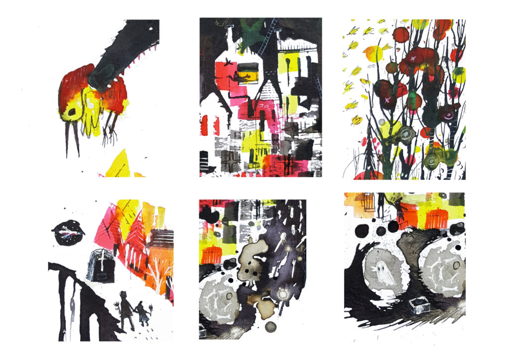
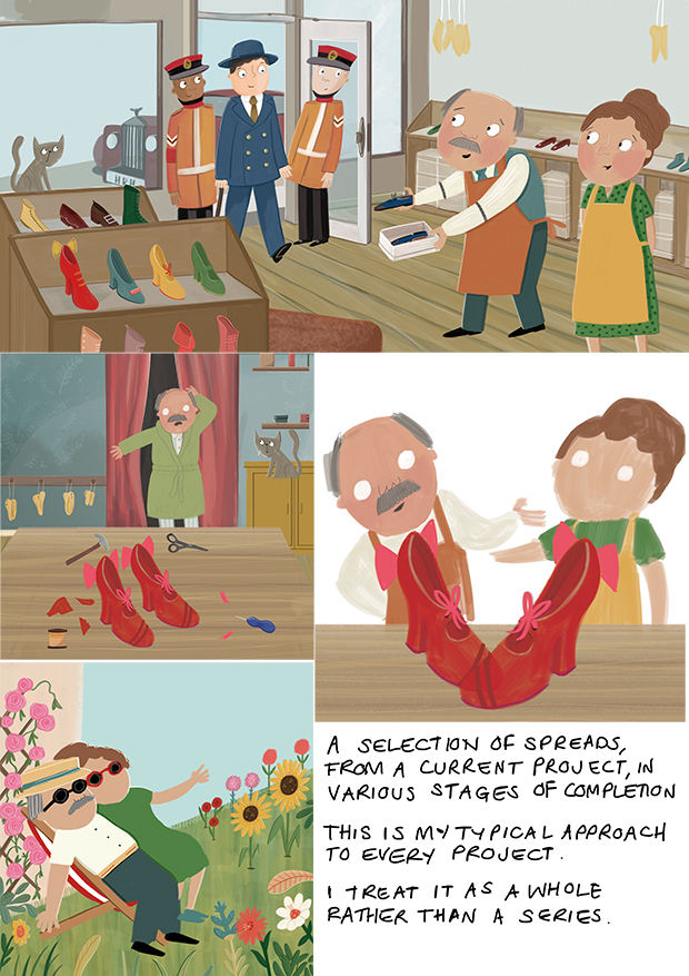
Synoptic: use of a single scene where characters and actions are repeated to tell a story.

Panoptic: uses friezes or scenes that are not physically connected, each one depicting a full action without repeating characters. Myrioramas could be considered panoptic.

Progressive: characters are not repeated but there is evidence of time passing. An example would be a clock with it’s hands spinning, or daytime turning into night while a character sits peacefully in a chair.

Sequential: Moments trapped in frames of some sort, as used in many comic books.

For the time being, my interest lies with synoptic narrative, but that is not exclusive. Narrative in all of its guises can be exploited for many purposes within illustration . From instruction manuals and puzzles, to illustrating poetry and picture books (Slap Happy Larry, 2017) in a way that involves the participant in a more interactive way, I find the whole area fascinating.

ARTSOME.CO. (2017). Artsome. [online] Available at: http://www.artsome.co/Narrative_Art [Accessed 3 Dec. 2017].

SLAP HAPPY LARRY. (2017). Continuous Narrative In Picture Books. [online] Available at: http://www.slaphappylarry.com/continuous-narrative-picture-book-illustration/ [Accessed 3 Dec. 2017].

Dark Picture Books And The UK

Whilst we have access to these books, often as translated texts and censored versions, we are not as enlightened as the Scandinavians or Europeans in terms of what we allow our children to read.

Attitudes surrounding children’s literature vary around the world. Lessons deemed important in Africa may not be so in Europe. Tales from Australia may not resonate with Asian communities. This is why it is essential to be mindful of our audience when it comes to writing and illustrating for mainstream publishing. However, occasionally it is important to push the boundaries to try and bring about change, or to respond to changing attitudes as generational  and social climates adjust.

Scandinavia is particularly progressive in this area and has a much broader range of picture books that deal with the issues that we would treat as taboo in the UK.

A couple of particularly interesting articles surfaced during my research regarding the translation of these texts, not just into English, but also for Scandinavian readers from original English versions.

Garmann’s Summer (Hole, 2006) has been translated from Scandinavian to various languages. The book has been celebrated for its originality in its place of origin. Other countries, like the US have brought the books suitability for children into question. (Johansson, 2013).

Garmann’s Summer

The Tale of Peter Rabbit (Potter, 1902) was translated From English to Finnish in 1967. The translated version has elements that were not directly translated from the English version (Ketola, 2017). Mr. McGregor the farmer was translated as a ‘bogeyman’. Peter’s fear was exaggerated into terror. This was done with the aim of frightening children rather than to tell a cautionary tale.

Image result for the tale of peter rabbit mr mcgregor
The Tale of Peter Rabbit

This struck me as important in relation to my research into wordless narratives. Does the lack of control via written translation hinder how far reaching these silent picture books could be, or does it help as they encourage the reader to form a narrative relative to their level of understanding? This ambiguity only has ramifications if it’s too explicit in visual detail than to have meaning other than what the illustrator intended. Whilst concrete details, such as death, must be laid for the narrative to be rooted, the level of exploration of the theme of death would be relative to how the reader decodes the rest of the page.

HOLE. S, (2008) Garmann’s Summer. Translated by D. Bartlett. Michigan: Eerdmans Books for Young Readers

JOHANSSON, V. (2013). ”I Am Scared Too‘: Children’s Literature for an Ethics beyond Moral Concepts’. Journal of Aesthetic Education. 47 (4). p. 80.

KETOLA, A. (2017), ‘Peter Rabbit in the Garden of Terror: Patronizing the Reader in Picturebook Translation’. Bookbird. 55 (3). p. 12.

POTTER, B. (1902) The Tale Of Peter Rabbit. London: Frederick Warne & Co.

Symbolism in Visual Storytelling

A story requires some sort of narrative if it is to be classed as such. What I’m concerned with, is visual narrative. How far you can take a narrative with images alone, and how you can provoke an emotional response within the reader, are the areas that I’m researching.

Once the illustration is created, my narrative suddenly becomes less important. Once distributed, the story that I’d attached becomes irrelevant, other than to those who want to know what was behind its creation. Instead of handing a narrative to a reader, I’m far more interested in their interpretation of the elements I’ve presented.

Prey, 2017
My Narrative

To see the illustration the way I intended, I suggest viewing it before reading my narrative below. This way, you allow yourself to engage with it using your own knowledge and feelings, thus forming your own narrative.

In this synoptic, ‘Prey’, I’ve illustrated loss. My narrative begins near the top centre where a boy’s pet bird escapes through an open window. The boy didn’t make sure the window was closed because he thought his bird loved him and liked being his pet. The nature of a bird is to fly free, but this bird had lost it’s instincts after a safe and nurtured life in a cage. The bird flies straight to the trees and joins the flock, but he is different. He has forgotten that he is prey. He doesn’t know about danger, and the nature of other animals, and is caught by a fox who kills him to feed her young. In the meantime, the boy and his father are out looking for the bird. The boy climbs the hill but there’s no sign. The boy eventually realises that the bird is dead. He imagines the bird as a spirit and as bones. They bury a box with a feather in it to symbolise the bird, and again, humanise it. They visit the birds grave with flowers every day and the boy feels closer to the bird, and starts to accept his loss.

When I use symbols, I try not to be too obscure. Although there is a certain level of decoding required, I’ve tried to make the symbols within my own work quite simple – for instance, in ‘Prey’, I’ve used small symbols in the fox’s tail – cutlery – to suggest that the dead bird has been eaten. Obviously foxes don’t use knives, forks and spoons, but it symbolises eating to every age group.

I’ve researched established creators of the wordless picture book to find out what methods and systems they use to make their story heard. I found it easier to understand by breaking down the features of each illustrator and then making connections between them. This helped me to pull out common features and try and compare where I fit in and what techniques I could employ and bring into my own practice.

Shaun Tan

Obscure and hazy elements, never overly defined.
Characterisation is sophisticated and realistic.
Symbolism is not overly difficult to decode.
Sketchy line.

Pam Smy

Focus on line and detail, usually black and white.
Contrast used to create drama.
Fine detail, especially in outdoor scenery.
Cinematic quality to compositions.

Suzy Lee

Expression through medium and mixture of techniques – charcoal with photography, rough lines with flat colour.
Symbolism needs some sophisticated decoding at times.
Lighting used to dramatic effect – in collage work, the use of physical lighting helps to create this effect, while in flat work, stark black shadows against a white background.

Hansel and Gretel Illustrated by Kang San

Many illustrative examples of Hansel and Gretel (Grimm et al., n.d.) exist, from the modern to the atypical style of a land far, far away. The story is inherently violent and features weak, flawed, abusive, and evil characters. Combined with abandonment and cannibalism, it is one of the most disturbing stories that still exists in mainstream children’s literature today.

There is a grittiness to the story that is often diluted by overly whimsical illustration, too neat and fluffy to truly reflect the peril the children are in, and the fear that is woven into their story.

Whilst it could be argued that illustrations of a darker nature could make this a negative experience for the young readers overall, I can’t help but draw upon the feeling I would get as a child when I would take my sister’s book about mythological creatures from the shelf, and scare myself by looking at the illustration of the Minotaur on the cover. I’d tentatively open it and look at Medusa and Cyclops before putting it down, pulling the duvet over my head and lying awake and wide eyed, for what seemed like hours, before I could go to sleep. Sure enough, I’d repeat this routine at least once a week. Looking at it now, it was the risk factor that drew me in. I wanted to be scared from a safe distance. The chance to look at something curious and frightening close up, with no real threat. Ultimately, it made me curious to actually find out more and read up on the subject, but it was all about the pictures at first, they had me hooked. This was alluded to by Liudmyla Smalko (2014) while researching modern trends and themes in children’s literature. She asserts that “Violence is an important, if unpleasant, aspect of the world that has endured for centuries and continues today, therefore, it is a relevant and worthwhile topic to focus on in children’s literature.” I find myself increasingly agreeing with this idea and believe that rather than finding a way to dampen the interest, we should be looking for ways to present, examine and deal with it.

Looking at these illustrations by Kang San made me think back to my sister’s book. Although the children are drawn in a whimsical and childlike way, this is at odds with the other elements and characters, which adds contrast in an unusual way. The disparity between the look of the characters adds a sense of unease that fits the story that’s unfolding.

1. Kang San, Hansel and Gretel. 2008

In this image (1), the sheer size, use of shadows and sophisticated features of the witch dwarf the children.  The contrast in the character styles is enough for us to decide that the children are in trouble. The textures and movement add an air of uncertainty, while the witch bears the colours of black, white and red – the atypical and highly symbolic colours of females within fairy tales – red as blood, white as snow, black as crow (Luthi, 1982).

2. Kang San, Hansel and Gretel. 2008

The image of the children hiding behind the tree (2) has been given an ethereal atmosphere by the use of imperfect textures and floating ephemera. Purple is usually connected with anything mystical and the grotesque shape of the witch peeping out from behind the tree is compelling and, I would imagine, exciting for a child to see. The witch hasn’t been diluted, or made to look cute, and the children look like innocent dolls, ready to be snatched.

3. Kang San, Hansel and Gretel. 2008

This image (3) shows the impact of lighting particularly well, and it’s an area I would like to bring into my own practice. San’s use of white space in all of these images is definitely something I can learn from, as is the deliberate and symbolic palette. This is an emotive collection that has the ability to heighten your senses due to the careful and considered use of contrast, colour and texture.

GRIMM, J., GRIMM, W., ZIPES, J. and DEZSO, A. (n.d.). The original folk and fairy tales of the Brothers Grimm.

LUTHI, M. (1982). The European Folktale: Form and NatureTrans. John D. Niles. Philadelphia:Institute for the Study of Human Issues.

SAN, K. (2017). Kang San. Klimtbalan.blogspot.co.uk. [Online] Available at: http://klimtbalan.blogspot.co.uk/2010/06/kang-san.html [Accessed 13 Nov. 2017].

SMALKO, L. (2017). English children’s literature: modern trends in themes and narrative strategies. [Online] Esnuir.eenu.edu.ua. Available at: http://www.esnuir.eenu.edu.ua/handle/123456789/11059 [Accessed 13 Nov. 2017].

The Surrealist Illustrations of Julia Iredale

A search for exemplar images of Chinese narrative illustration in contemporary practice introduced me to the work of Julia Iredale. There are very few examples of this type of illustration, I would argue that this is because it is very difficult to execute.

From an illustration point of view, whilst Iredale is a highly skilled illustrator, the narrative in these images isn’t always clear. The titles of these paintings do conjure up a sense of what you are looking at, but the intent to tell a story doesn’t appear to be there. There is a sense of trying to capture the essence of a character, but in a surreal and mythological way.

Image result for julia iredale
Julia Iredale, A Forever Forming World

In A Forever Forming World there is a sense of the character being a creator. A subtle vignette is constructed by water droplets, rocks, trees and clouds – symbolising the elements of earth, air, water and, perhaps, fire (volcanic rock). The central elements are prominent and focus on water and environment with almost abstract egg and sperm cells, representing fertility, leading to an open door with an eye inside. The eye is new life and the roots falling from above are protecting and nurturing.

GothicManorFinal_small.jpg
Julia Iredale, The Widowed Ghost

In The Widowed Ghost, there is a strong sense of character again. The Victorian silhouette references the portrait style of the era, while the full length cut out in the centre shows the fashion. The palette evokes a Gothic and sombre atmosphere, helped along by the churchyard in the background. Reflecting on the title of the image invites you to create a story based around the character, I found this more evocative than the image itself. How can a ghost be widowed? What does that mean? Are we not seeing the ghost in the image, is this a wife that’s been left behind, rather than the ghost wandering?

TheProtector_small.jpg
Julia Iredale, The Sleeper

This is a different style from the others as no frame or interconnecting element is present. This attracted me for the suggestion that this giant has been awakened from his slumber, the placement of trees, earth and roots showing us that his resting place is just under our feet. Is this a visual representation of the earth taking a stand against man and wielding its power? Perhaps a response to the spate of natural disasters that are occurring worldwide at what seems like an increasing rate.


Neverlandsmall.jpg
Julia Iredale, Neverland

Until I read the title of this image, I didn’t make the association with Peter Pan (Barrie, Frank &Torrey, 1957). I made connections afterwards. If my prior knowledge had been more developed, maybe that connection would have been made, like the ‘concrete’ element as detailed in my post about the Singapore maths method. I would have been armed to decode the image. I use image rather than narrative, as the single instances of the characters within the frame doesn’t encourage me to read or enquire, there is no evidence of a synoptic view. I can read this particular moment, but I don’t see a story or action here.

BARRIE, J. M., FRANK, J., & TORREY, M. (1957). Peter Pan. New York, Random House.

IREDALE, J. (2017). Julia Iredale Illustration. [Online] Available at: http://www.juliairedale.com/. [Accessed 13 November 2017].

Visual Narrative In European Picture Books

Colour meanings and symbolism depends hugely upon cultural heritage. For the purposes of this post, I’m looking at European illustration and the basic associations made in this part of the world.

During the course of my research, I’ve been looking at the work of illustrators that I’ve never seen before. Primarily this is because my style is whimsical and humour based rather than having any real weight in terms of dramatic effect or heavy detail, so my research for live projects typically involves looking at similar styles.

My interest in symbolism within picture books has obviously brought lots of new reading matter my way. Of particular note are Panther (Evens, 2016) and Le Chien Que Nino N’avait Pas (van de Vendel & Van Hertbruggen, 2014).

Brecht Evens, Panther. 2016

The use of pattern and expression in this graphic novel are beautiful. Watercolour washes and expressive lines are used to convey a huge range of emotions within the characters. The content is very dark and there is an ambiguity right the way through; a hidden meaning or subtext that makes you feel hazy and wonder if your interpretation of the scenes is right. This results in uncomfortable realisations part way through. The switches between a bright and full palette to reds and blues is extremely effective at causing an emotional shift in the viewer. It creates a sinister atmosphere without, at the beginning, explanation. I’m particularly attracted to the scenes where washes have been used to layer the scenes. The cover is particularly well executed, using pattern and colour to remove the hierarchy of the elements and the composition is chaotic. Everything is obscured in plain sight.

Image result for le chien que Nino n'avait pas
Edward van de Vendel & Anton Van Hertbruggen, Le Chien Que Nino N’avait Pas. 2014

The first thing that drew me to Le Chien Que Nino N’avait Pas were the colours and expressive painting style. Each spread looks like a work of fine art, packed with symbolism, but far more subtle than the work of Anthony Browne, although the theme is very similar to Browne’s ‘Into The Woods’. Blotches of colour and unresolved facial expressions and poses give this style a grittiness that feels very true to life. The disinterested Grandma always facing away from the reader is always reading, glass of wine at her feet. The protagonist’s father is a pilot so it’s clear that he travels a lot and Nino (his son) is lonely. We sense this from the start as there are planes, space shuttles, globes, cultural artefacts and birds threaded throughout. Nino has an imaginary dog that is expressed in line alone. The juxtaposition of the reality and fantasy element works beautifully to express the relationship between a boy and his imaginary friend, and the purpose that his companion serves.

Refs:

EVENS, B. (2016) Panther. London: Drawn & Quarterly

VAN DE VENDEL, E. & VAN HERTBRUGGEN, A. (2014) Le Chien Que Nino N’avait Pas. Paris: Didier Jeunesse.

A Non Linear Working Style

As a practising illustrator, my working methods have always been non-linear. I find it difficult and constricting, with any project that consists of more than one image, to work on one spread at a time. This isn’t a problem at the rough stages and I can produce the pencil sketches in a fairly linear manner once the manuscript has been given to me. It’s the part when it comes to colouring the spreads that I have to complete as a whole.

Currently I’m illustrating a re-worked version of The Elves and The Shoemaker (Miles Kelly, 2018). There are a mix of 22 double and single page spreads. I’ve started work on all of these and they will all remain in a part finished state, adding more and tweaking as I go, until I’m ready to finish them all in an order that makes sense to me, rather than the numbered page order.

This can be a sticking point for clients so I ask them if there are any spreads they need me to work on first (this is especially important around the major children’s book fairs like Frankfurt and Bologna) where publishers are often selling books and rights on the strength of one or two spreads and a cover. This is always the most difficult part of the process for me as I find it difficult to make sense of why I’m starting at that particular point, finishing the spread and then starting on the others separately as if they’re part of a different set.

Personal work. 2017

I think this method comes from the storymaker aspect of what I do. I’ve spoken to other author/illustrators who often formulate a story and the illustrations at the same time. This process usually starts with a sketch of a character or an idea for a scene and then we build out from the middle or the end and rearrange the parts of the story until they’re in the most satisfactory order.

I can, and have, worked in a linear way when clients have requested it. I don’t feel that I produce my best work by doing this as I lose the freedom and ability to slowly layer and build up each spread. This results in me feeling stifled and just wanting to get the work done which can lead to the work losing its character. An experienced illustrator told me, when I was right at the start of my career, to always remember “You’re not a sausage factory”. As funny as that sounds, it really resonates, especially now that I too have some experience behind me. I don’t want to keep producing the same thing on demand every day, with the same ingredients, in the same way.

Looking deeper into this non-linearity, it seems to be the way I approach things in general. To avoid an overly digital look to my work, I like to build colour and texture in layers, juxtaposing soft brush textures and hard edges over a contrasting underpainting. I do appreciate that thought processes and actions usually have a beginning and end, but I definitely like to take a more holistic approach.

Peter Brown’s working methods are very similar to mine except he plans his spreads in order of difficulty. I don’t account for this ranking system when I’m working in colour but I do make sure everything is worked up to a similar level before going to final art on any spread.

I’m reflecting on this here as this is something fundamental that underpins my work. Efforts to change this, or workaround it, always leave me with a deep sense of dissatisfaction. Although illustration is a commercial discipline, this is one of my sources of freedom during the creative process.

SEVEN IMPOSSIBLE THINGS (2010), Seven Things Over Breakfast With Peter Brown. [Online] Available at: blaine.org/sevenimpossiblethings/?p=1920

Anthony Browne, Surrealist Storytelling and Symbolism

“…Surrealism seeks, at least in some sense, to revisit childhood but is aware that it can never “be’ childhood” (Hateley, 2009, p.331)

[This quote comes from an article exploring the work of Anthony Browne and asking pertinent questions about the motivation for his references to the work of Magritte, and whether or not Browne has appropriated Magritte’s work. Hateley  argues that it isn’t appropriate that the work of a known activist with Communist leanings be used for capital gain or recognition.]

Surrealism is a great way to enhance children’s illustration and is dependent on the age and emotional state of the viewer. This is great for creating an otherworldly quality which is difficult to put into words. As I’m looking at narrative that is carried along primarily by visuals, it would be careless of me not to consider the impact of surrealism on the pictures I make.

I don’t want to travel down the same path as Browne and make actual references to canonical work within my own, I don’t see the benefit of doing this and feel it would take something away rather than adding value. I’m not trying to educate others on the history of Surrealism or any one particular artist, just draw upon the style.

As a way to tap into childlike memories and fears, I find surrealism to be a source of inspiration and solutions to illustrative problems within a set space. A single spread to accompany a folk tale or poem would be less effective without some surreal elements. Blending elements together and having images flow in and out of each other is particularly effective for more emotive work where cartoon styles would appear glib.

Image result for anthony browne little red
Anthony Browne, Into The Forest. 2005

Anthony Browne manages to pack a lot of symbolism into his work, along with the surreal references. This spread highlights how he uses colour and recall to disguise small elements within the spread that the viewer can seek out should they choose to spend time really looking at what’s on the page. Once you spot one of the elements blended in with the background, your eyes start to dart around looking for more. The limited palette that Browne has used in Into The Forest works well to keep the secrets on the page by pulling our focus to the boy’s red coat. Requiring some effort by the viewer to start piecing things together and making connections to knowledge they’ve already gathered. If they don’t possess that knowledge, then the spread is laden with points for conversation: a spinning wheel, a pumpkin, a shoe, a cat, blackbirds, a tower.

This use of colour as a signifier of something being amiss is used to great effect by Suzy Lee, particularly in her wordless narrative work. Where Browne uses colour against black and white backgrounds, Lee uses the same contrasts but to add a dimension of fantasy worlds meeting reality. Still a meeting of dual narrative pathways, but Browne uses symbols literally and visually. Lee draws upon knowledge that the viewer already has about folk tales and literary works alike.

Suzy Lee, Shadow. 2010

Going back to the quote, these symbols of childhood are a way to achieve a richness within the illustrations of a book that makes a child want to revisit a story time and again, and for that story to retain a ‘specialness’ that is unique to that reader. We each have a version of childhood within our minds and while those are all different, the overlaps all contain an essence of something that, whilst it isn’t childhood itself, we can relate to. This isn’t necessarily age related, I think it has more of a connection with nostalgia and also, for children themselves, a peek through the keyhole at an idyllic, fantasy picture of a different version of childhood.

HATELEY, E. (2009). ‘Magritte and Cultural Capital: The Surreal World of Anthony Browne’. The Lion and the Unicorn. 33, (3). p. 324-348.

LEE, S. (2016). ‘Suzy Lee’s Adventures in Picture book Land’. Bookbird, 54 (4) .p. 17.

A Monster Calls: Style

I watched A Monster Calls (2016) a few weeks ago and the animated scenes have stayed with me, not just because of their emotional pull but also the amount of techniques used to create them is immense.

Image result for hans bacher
Hans Bacher, Beauty And The Beast Concept Art. 1988

As well as the technical skill, the styles themselves are influenced by artists I admire and follow. In particular, especially in the first sequence, I see Hans Bacher in the backgrounds and the figures have an unmistakable air of Henry Moore.

This still is from Hans Bacher’s concept art for Beauty and The Beast. The saturated colours and obscured detail, teamed with lots of movement, have clearly influenced some of the visual direction, particularly sequence 1.

Henry Moore, King and Queen. 1952

The ethereal textures, colours and atmosphere of Bacher’s illustrations combined with the sheer size and silent presence of Moore’s sculptural style is perfect for creating a narrative that relies heavily on imagery. Both very strong within any composition, the end result is very dramatic rather than whimsical. It stays with you long after the film and it is a work of animation that can be revisited and seen with new eyes each time.

Going back to my earlier post on Chinese narrative illustration is important in relation to this. I’ve been sketching and pushing myself out of my comfort zone on the advice of my tutor, Kate. I was hesitant at first and when Kate suggested going back to paper and traditional media, I remember putting up a bit of resistance. After reflecting on my response to that suggestion, I pulled together some supplies and started to experiment. Those experiments and my keyword are what brought me to Chinese narrative illustration, and what pushed me to look at the intricacies within those works. The characters within the Chinese paintings aren’t highly detailed. Often, especially in the synoptic view pieces, the characters expressions and body language aren’t very clear at all. Is this to allow the viewer to enhance the stories in their own way, using their own imagination? I suspect so.

When I looked again at sequence 1, it struck me how the shape of the character was more prevalent than the character itself. The detail of the King and Queen in particular is almost completely obscured and practically silhouette. Due to the nature of the complete film, these animated scenes are to aid storytelling. Detail has been stripped from certain characters and injected into the backgrounds instead. The settings are beautifully created and presented in parts; ink blooms and water effects spread across the scenes as they come alive. This creates an emotional response that doesn’t require us to get to know the characters – they’re just part of a wider story. This also allows for an element of surprise. That said, the characters expressions are not easy to gauge so we use our own imagination to project what we think these huge looming figures are thinking, and what their motives are. The characters that feature slightly more detail are projected in a different way and we see a little more of their detail which influences how we feel about them. We make a decision about whether they are bad or good.

In relation to the film, this is done to make the point that when you are told a story, you fill in the blanks without knowing the facts first. A storytellers bias, or decision to withhold certain information, and our own state of mind, influences our perception.

In relation to my own practice, it’s a technique that I would very much like to explore further.

A Monster Calls. (2016) Film. Directed by J.A. Bayona. UK; Entertainment One

MOORE, H. (1952), King and Queen [ONLINE]. Available at: https://en.wikipedia.org/wiki/King_and_Queen_(sculpture)#/media/File:Henry_Moore_kingqueen.jpg[Accessed 22 October 2017].

BACHER, H. (1988), Beauty and the Beast concept art [ONLINE]. Available at: https://www.google.co.uk/search?q=hans+bacher&safe=active&source=lnms&tbm=isch&sa=X&ved=0ahUKEwjw_OSj1oPXAhVHVRoKHd1PCW0Q_AUICigB&biw=1920&bih=900#imgrc=iYCrrtYh8TsENM:[Accessed 22 October 2017].

Xu Shi Hua: To Tell The Matter In Pictures

Although there is no specific classification for ‘Chinese Narrative Illustration’ in Chinese culture, it is referred to as such when discussed in an academic and historic setting.

It’s important to note the differences between narrative illustration and Chinese narrative illustration here; not because of brush technique or painting styles, but as layout, presentation and formulaic considerations. Narrative symbolism exists in every culture, sometimes this is overt and sometimes it requires a deeper prior knowledge of issues that are indigenous within a particular group of people.

In 1998, Murray argued that this type of art can be identified by story, function and presentation.  She describes story as “…the presentation of one or more events that occur in a sequence of time and bring about a change in the condition of a specific character,” and adds that the function of narrative illustration is to record, affirm, inform, instruct, indoctrinate, proselytize, propagandize or entertain the viewer. She continues that the presentation of the image has an effect on the overall interpretation of the illustration. Compositional structure can be as simple as one monoscenic composition within a structural frame but is more commonly a single picture depicting multiple moments in one story, a synoptic view within a unified space. It’s perhaps a crude comparison but it’s difficult not to make comparisons to the infographic that has become increasingly popular of late, even down to the scroll format.

My interests lie in how a story unfolds when it is told in this way. This works particularly well for me as a storyteller keen to explore visual narrative. To push the viewer into perhaps branching off or being able to visualise more stories, or threads of backstory, through what is essentially just one page within a book, or a poster, homeware or furnishings around them.

The meeting of the different elements within a story and how they work together in one illustration is what I need to pin down. I’ve looked at the work of others in this area and some noteworthy artists that conform to the definition made by Murray (1998) for my own research are below. I’ve found that the majority of art I’ve been researching with these characteristics is classed as surrealist. The forms within the unified space have been deformed and morph in and out of each other, often turning head-space into landscapes or animals into treetops, all forming part of a metaphor that serves to guide us through a narrative.

Surreal illustrations by Julia Iredale // ink drawing // narrative illustration
Julia Iredale

This work by Julia Iredale is a surrealist piece that I would argue conforms to the constructs of Chinese narrative illustration in some way. There is opportunity for a synoptic view if recurring characters and action were added to the village behind. I think this is a very powerful image with the opportunity for a strong narrative with multiple interpretations.

Little red rididng hood & the big bad wolf - The girl who keeps dreaming
Artist unknown
Natalie Pudalov
Natalie Pudalov
Darlingface

MURRAY, J.K. (1998) ‘What Is ‘Chinese Narrative Illustration’?’The Art Bulletin. 80 (4) p. 602–615.